Posted by Matt on 6/10/2019 to
Adopting Mobile GIS
Why Does My GPS Data and Imagery Not Line Up?
I am often asked by clients why their field data collected with a highly accurate GNSS receiver doesn’t line-up the way they expect with their aerial imagery? Sometimes it is the imagery in their mapping app that appears “off” and other times its back on their desktop in their GIS software. It is a fair question, especially if they are using RTK and their points are accurate within inches. Assuming they are using their receiver correctly and there are not Datum difference issues, the problem isn’t with their equipment but with their reference imagery. Unfortunately, getting beautifully lined up imagery and field collected points is difficult and expensive. The real nuts and bolts of it all can make this a complicated topic, but we can stay higher level and still gain a good grasp of what is going on in these situations.
Satellite Imagery Isn’t Accurate?
To a certain extent it is, but satellite imagery is not as accurate compared to the real world as most people believe. The rough guidelines I refer people to is that in metro areas, the accuracy of aerial imagery could be on average about 0.5 meters. But rural areas could be on average 1 to 1.5 meters or worse. For example, here (https://bit.ly/2ZcitfC) is an article that examined the accuracy of Google Earth imagery across the city of Montreal, Canada. The authors found that accuracy could be as good as 0.1 meters in parts of the city but as poor as 2.7 meters in other parts.
Mosaics
Readers can examine Google’s imagery specifications here (http://bit.ly/2ZhIQRn). The key terminology on this page is “mosaicked”. Even if the mapping app you are using is implementing Google, or Apple, or it’s Esri’s Collector with an input of satellite imagery from a variety of sources, they were all mosaicked.
There is a lot of algorithms and work involved in taking raw satellite images and converting them to useful photos. But after all that is accomplished, the photos are then overlain and stitched together, or mosaicked, to create a large continuous image. Where the photos overlap is where there can be a higher level of inaccuracies. Then in addition to that, we are taking the curve of the planet and flattening it out to view on a flat paper or digital map. All of these things erode the visual accuracy of aerial imagery compared to field data points collected with a high-accuracy GNSS receiver.
The image in Figure 1 is a good example of how the area on the map was moasaicked together from images captured on different days or by different satellites. The top half of the image is clear and crisp whereas the bottom half appears a little hazy.

Figure 1. You can see the Mosaic in this image with different brightness between the top and bottom half of this screenshot in Esri Collector.
How Do I Get Really Accurate Imagery?
You can go to a satellite imagery service and purchase better imagery, like DigitalGlobe or FASTMAP. In Figure 2 you can see a zoomed in screenshot of ArcGIS Online standard imagery and Figure 3 shows you pruchased imagery with a slightly different camera angle and more detail in the buildings and trees. You can then take advantage of this imagery in your desktop GIS application be it ArcMap/ArcPro or QGIS. Or you can get even better data if you have someone fly it with a plane or a drone and tie down the final imagery with highly accurate ground control points. That way your data is both accurate in the X and Y plane but also provides a high level of zoom to the imagery with pixel sizes as small as a few centimeters.
But for use in your Mobile Mapping app on your phone or tablet, you will be limited to more robust apps like Esri’s Collector. Most Mobile Mapping apps only have the ability to use their default imagery. This default imagery is usually Apple Maps on iOS devices or Google Maps on Android devices.

Figure 2. This is a screenshot of standard ArcGIS Online imagery zoomed in.

Figure 3. This is a screenshot of the same map extent as Figure 2. Only Figure 3 is purchased higher resolution imagery that is more current than the imagery in Figure 2.
Final Thoughts
We just have to keep in mind that we trust the data from our GPS/GNSS/RTK receiver over the aerial imagery.
So if you ever find yourself with a GPS salesperson and they say, “Hey, let’s go outside and hook this GPS up to my phone and we can look at how accurate we are based on where the receiver shows us on the aerial imagery in the parking lot”... just walk away because you are already more knowledgeable than that “expert”.
Update 8/29/2019
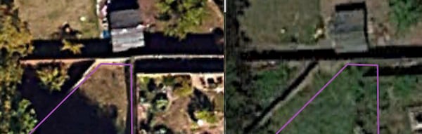
In an interesting turn of events, I have discovered another example of how easy it is for aerial imagery to be shifted from where we expect it should line up. After finishing this article, I was using an Arrow Gold RTK receiver and Esri Collector to map a property boundary to help a friend design some new backyard landscaping. To share it, I exported the data in a KMZ and put it in Google Earth Pro to look at it before sending it to the property owner. Everything looked to be lining up well in Google Earth but the imagery did not line up well in ArcGIS Online. So I started clicking through the timeline feature of Google Earth and found a fascinating amount of variation in the aerial imagery. I have included some of the screenshots with the time stamp to show just how easy it is for free aerial imagery to have shift problems.
2018

2016

2014

2012

Tagged Products